

UX Design
As a UX Designer at Gearbox Software, I focused on creating intuitive and engaging user experiences for AAA franchise, Borderlands. My work centered on designing interface systems that enhance player immersion while maintaining accessibility across diverse gaming audiences. I collaborated closely with cross-functional teams including game designers, UI artists, and engineers to translate complex gameplay mechanics into clear, user-friendly interfaces. Key responsibilities included developing user flows for progression systems and optimizing menu navigation for console and PC platforms.
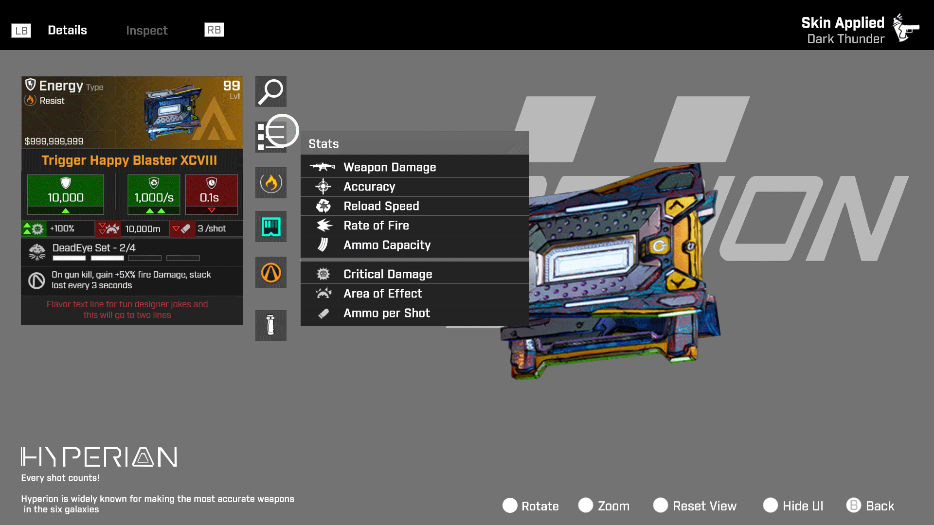
Item Inspect:
Was this special or junk? Get me back to the game!
Borderlands 4 is the latest entry in the acclaimed "looter shooter" franchise, combining first-person shooting with frenetic combat, character progression, and extensive loot collection.
The game emphasizes cooperative gameplay for 1-4 players, featuring scaling difficulty and dynamic loot quality. Players hunt for superior weapons from millions of procedurally generated combinations, creating an addictive kill-loot-upgrade cycle.
The Problem:
Player earned items display (item card) suffers from information density that impedes users and lowers engagement retention. Often users experience cognitive overload when attempting to analyze condensed item data, creating friction between information consumption and core user objectives.
Previous design iterations employed highly compressed item cards displaying comprehensive information sets. This approach failed to establish information prioritization, resulting in visual noise that obscured key user decision points.

When the player examined their loot, the same item card was re-used.
The item inspect screen was not helpful for players

The item inspect screen should alleviate that but re-using the item cards in the layout did not resolve any friction. Information was still condensed in the item card format. Thus, friction between information and core user objectives remained.
-
Information Hierarchy Failure: Current item inspection screens lack clear visual hierarchy, presenting all data points with equal visual weight.
-
Cognitive Load: Dense information displays overwhelm users' processing capacity, hindering efficient decision-making.
-
User Flow Disruption: Complex data parsing interrupts user journey and reduces time spent in core engagement activities
-
Prioritization Breakdown: When everything is important, nothing is important.
Ideas:
After defining the problem it was time to ideate solutions.
Progressive Disclosure
-
Primary View: Display only essential information (item name, rarity, key stats)
-
Secondary Actions: "Show Details" expandable sections or drill-down navigation
-
Contextual Reveal: Show additional data only when users indicate interest


Information Hierarchy & Visual Layering
-
Scannable Layout: Use typography scale, color contrast, and spacing to create clear information priority
-
Visual Grouping: Cluster related data points with consistent visual treatment
Performance & Flow Optimization
-
Lazy Loading: Load detailed information only when accessed
-
Quick Preview: Tooltip or modal overlays for fast information checking
-
Breadcrumb Navigation: Clear pathways back to main gameplay without losing context
Mockups and prototypes:
The transition from restrictive item cards to full-screen adaptive layouts delivered immediate improvements. Removing uniform card constraints enabled contextual information scaling and natural visual hierarchy through strategic whitespace usage.
Users experienced reduced friction for faster decision-making and information parsing tailored to individual preferences. Item inspect now prioritizes essential information without cramming data into limited spaced card layouts, while tooltips on hover enable players to access details based on their specific priorities.


Results:
Moving beyond the card format was a turning point. Without rigid container constraints, we could structure information around player intent rather than format requirements. This created better player balance between information access and engaging gameplay.
-
Critical item attributes were surfaced at the top level, enabling quick comprehension without cognitive load.
-
Players could drill down into detailed information on demand, accessing deeper layers only when needed.
-
The earned item became the hero element, showcased in rendered 3D to create an emotionally satisfying moment of reward.

Loot Feed:
Was that a legendary in a haystack?
A loot feed in videogames is a real-time notification system that displays items, rewards, or pickups as players acquire them during gameplay.
The loot feed creates satisfying moment-to-moment feedback that makes collecting items feel rewarding. It's especially important in loot-driven genres like RPGs, looter shooters (Destiny, Borderlands), and battle royales where acquiring better gear is core to progression. Without it, players might miss valuable pickups or not realize they've found something significant.
It's essentially the game's way of celebrating your discoveries and keeping you informed about your growing arsenal or inventory, which feeds into the psychological reward loop that keeps players engaged.
The Problem:
During intense combat sequences or rapid looting sessions, items can be automatically picked up or grabbed so quickly that players miss on-screen notifications or pickup animations.
This is compounded by little visual distinction between similar items where multiple items might be mistaken with another. Making it very hard for players to immediately recognize the value of what they've acquired and return the fun.


I needed to address information management where players easily miss what they've collected, especially during intense combat or when items are automatically picked up. Or during group gameplay where teammates pace drastically outpaced others.
Design, process and ideation:
When designing loot feed placement on the HUD, I had to keep in mind, the key is balancing visibility with gameplay interference. Most games position loot feeds in the upper-right or lower-right corners of the screen, as these areas typically don't contain critical HUD elements like health bars, weapon status, or action buttons that players need constant access to. The feed should be close enough to the player's peripheral vision to catch their attention, but far enough from the center of the screen to avoid obstructing important HUD information like enemy movements or targeting reticles.


After placement I focused on the layout, iconography, and textual language of the individual entries to separate multiple entries that could display to the player.
While some were based on player actions, many items are automatically picked up. Where the confusion level would increase. Examples like ammo, currency, and various gameplay/story items.


I based the loot feed entries on several key visual design factors: strong typography, clear iconography, distinct colors, and recognizable shapes.
With accessibility in mind, I incorporated shape language using single and multiple dots to denote rarity levels, ensuring the system communicates effectively beyond just color. This approach makes the rarity hierarchy immediately recognizable for all players, including those with color vision differences.
The design was further enhanced to maximize psychological reward reinforcement. Legendary items, underwent multiple redesign iterations to amplify the satisfaction of acquisition by making each drop more visually prominent and celebrated.
After several rounds of feedback with design, UX/UI, and engineering teams, we established a final design that addressed typography clarity, distinct iconography, high-contrast colors, and recognizable shapes. This resulted in clear hierarchical tiers that effectively communicate item value at a glance. The accessibility dots evolved and polished into slash marks.


Upon early approval, I re-worked designs to other project gameplay modes. In this case, riding vehicles limitations and classic split-screen modes


Additionally, I worked motion comps to provide guides for engineers. How the entries would intro in, display, and disappear. Including distinctive rules, like rarity tiers.
The team found these particularly helpful in implementation


Results:
The final loot feed design successfully addressed the core problem of players missing item pickups during fast-paced gameplay through strategic screen placement and enhanced visual hierarchy.
By implementing strong typography, clear iconography, high-contrast colors, and accessible shape language (including dot patterns for rarity), the new design ensures players can instantly recognize item value regardless of color vision abilities. Early iterations that relied solely on color coding didn't work effectively, as they failed accessibility standards or became distracting during intense combat with heavy visual effects.
Overall, the loot feed enhanced the reward loop that keeps players engaged and motivated to continue playing by providing clear visual confirmation of valuable acquisitions.